
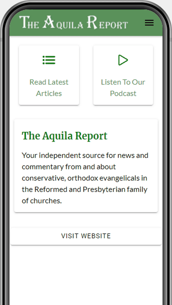
Two buttons up front
Plenty of publishers try to fit an entire website into an app. The Aquila Report went the other way. Its home screen offers just two large cards, Read Latest Articles and Listen To Our Podcast, with a short description of the magazine beneath them. Everything else is a tap away. The publisher built the app with AppPresser's app builder.
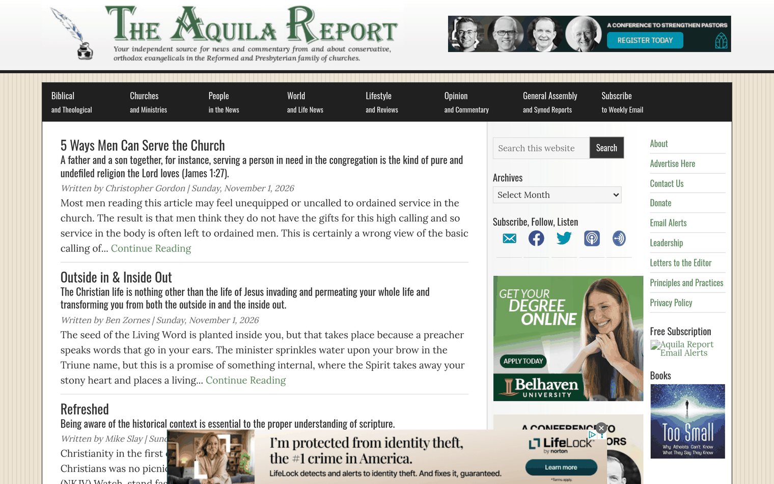
About the magazine
The Aquila Report has published since 2008. It is an independent web magazine of news and commentary for and about the evangelical and confessional parts of the Presbyterian and Reformed church family. Reformed Churchmen Publications, a 501(c)(3) nonprofit led by a board of ordained officers, publishes it. Most articles come from other publishers, pastors and writers, and the work is funded by donations and sponsored ads. The app has been available since 2017, built by the publisher on AppPresser.
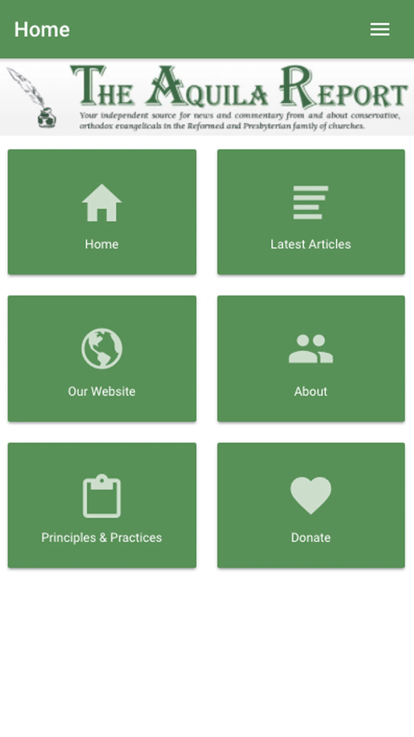
Navigation anyone can follow
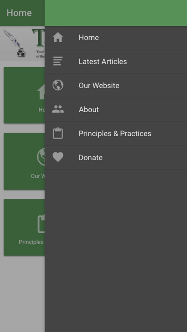
Below the masthead sits a grid of six big tiles:
- Home
- Latest Articles
- Our Website
- About
- Principles and Practices
- Donate
The slide out menu repeats those six from every screen, so nobody gets lost. About and Principles and Practices explain the magazine's purpose and editorial standards, and Donate lets readers support the nonprofit directly.
Its readers
Church members and officers following news from their denominations, pastors and elders who want to skim a lot of commentary quickly, and anyone who likes to read or listen while out and about.
Under the masthead
The website uses WordPress with the Genesis framework, GiveWP for donations and AdRotate for sponsor ads. New articles posted on the site appear in the app through AppPresser.
Why less was more
A focused app is easier for a small nonprofit team to maintain, and easier for readers of every age to use. Years of steady service for a loyal audience are the proof.